


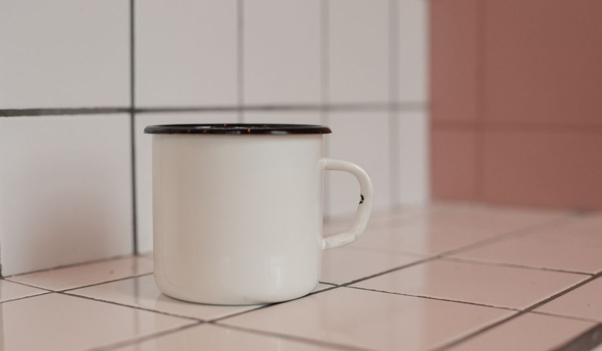
Grout Is a Design Decision, Not an Afterthought
Most of us spend weeks choosing tiles and roughly eleven minutes choosing grout. That order is back to front. Grout covers a surprising amount of the surface you will actually look at — on a metro-tiled splashback with 3mm joints, it can account for nearly a fifth of the visible wall. Change the grout and you change the room.
It is worth understanding what grout does before you order it. Broadly, it either disappears or it draws lines. Disappearing grout makes a small bathroom feel bigger and a busy pattern feel calmer. Drawing lines makes a plain tile look considered and turns a geometric floor into a feature. Neither is right or wrong — but you have to pick one deliberately, because you cannot have both.
Matching Grout for a Seamless, Calm Finish
Matching grout to your tile is the safest choice and, honestly, the one most British homes suit best. It works especially well in small spaces: a narrow en-suite, a downstairs cloakroom, a galley kitchen where a strong grid of joints would make the room feel chopped up.
It also flatters tiles that have a lot going on already. Victorian-style patterned floor tiles, marble-effect porcelain with heavy veining, and anything with a printed patchwork design all benefit from joints that fade away.
- Best for: small rooms, patterned tiles, marble and stone effects, low-contrast schemes.
- Watch out for: matching too literally. A tile has a shade range, and grout that matches one tile perfectly may look slightly off against another from the same box. Selecting a shade that reads as the average tone of the tile is usually more forgiving.
Contrasting Grout to Bring Out the Pattern
Contrast is where the drama lives. White metro tiles with dark charcoal grout are a familiar look for good reason — the joints become part of the design, giving a crisp, almost industrial finish that suits kitchens and utility rooms. Hexagonal tiles with contrasting grout reveal their honeycomb shape. Plain rectangular tiles laid in a herringbone suddenly look expensive.
Contrast works in the other direction too. Dark tiles with pale grout lighten an otherwise heavy wall and can look very sharp in a bathroom.
- Best for: plain tiles, geometric shapes, herringbone and chevron layouts, period-style kitchens.
- Watch out for: contrast amplifies every imperfection. Uneven joint widths, a slightly bowed wall, or tiling that has been rushed will be far more obvious in black-on-white than in a tonal scheme. If your substrate is not perfect, choose a gentler contrast.
Tonal Shades: The Middle Ground That Rarely Disappoints
If you want the texture of visible joints without the graphic punch, go tonal. That means a grout a shade or two lighter or darker than the tile, rather than a full contrast. A soft grey grout with a pale grey tile, or a warm sand grout with a beige porcelain, gives definition without shouting. It is the option I would recommend most often to anyone tiling a room they have to live with for fifteen years.
Tonal choices are also the most forgiving of everyday life. They hide the slight variations in tone that come from grout drying unevenly, and they do not make you feel obliged to scrub the joints weekly to keep the scheme looking intentional.
Joint Width, Lighting and the Wet-Room Reality
Grout colour does not exist in isolation. Joint width changes everything: a 2mm joint in a matching grout is nearly invisible, whilst the same grout at 5mm reads as a visible grid. Large-format floor tiles often look best with narrow joints and a matching grout, whereas quarry tiles or hand-made ceramics usually want wider joints and more visible grout.
Light matters too. North-facing rooms and bathrooms with small windows flatten everything, so a subtle tonal contrast can vanish completely. Under warm artificial light, greys can turn muddy and whites can look cream. If you can, view your sample in the actual room at different times of day.
Then there is the practical side:
- Floors: darker grout hides traffic marks and mop residue far better than white.
- Showers and wet rooms: very light grout on shower walls shows soap scum and early mould, so a mid-tone is often the kinder choice. Use a suitable waterproof grout and a silicone sealant at the internal corners and where tiles meet the tray or bath.
- Grout type: cement-based grout is easy to work with and fine for most walls. For shower floors, wet rooms, and anywhere that gets heavy cleaning, an epoxy or epoxy-modified grout resists staining and discolouration much better, though it is less forgiving to apply. Some cement grouts benefit from a sealer.
- Cleaning: bear in mind how porous your chosen grout is. Once it has picked up dirt, it is very difficult to bring back to its original shade.
Test Before You Commit to the Whole Room
Never choose grout from a colour card alone. Grout looks considerably darker when wet and dries to something in between, and the tiny chip on a swatch tells you very little.
The reliable approach is to fix three or four spare tiles to a board or an offcut of plasterboard, using a different grout in each section. Let it cure fully — at least 24 hours, longer in a cold room — then prop the board up in the room you are tiling and look at it in daylight and in the evening with the lights on. It costs you an hour and a handful of tiles, and it is the single best way to avoid standing in a finished bathroom wishing you had chosen charcoal.
One last thought: buy all the grout you need in one go, from the same batch. Grout shades vary slightly between batches, and a part-finished wall is a poor place to discover it.


Leave a reply